
Raise your hand if you remember Grady Booch.
His book Object-Oriented Analysis and Design with Applications helped and inspired me a lot back in the day. It was full of cool cartoons. My favourite is this one:
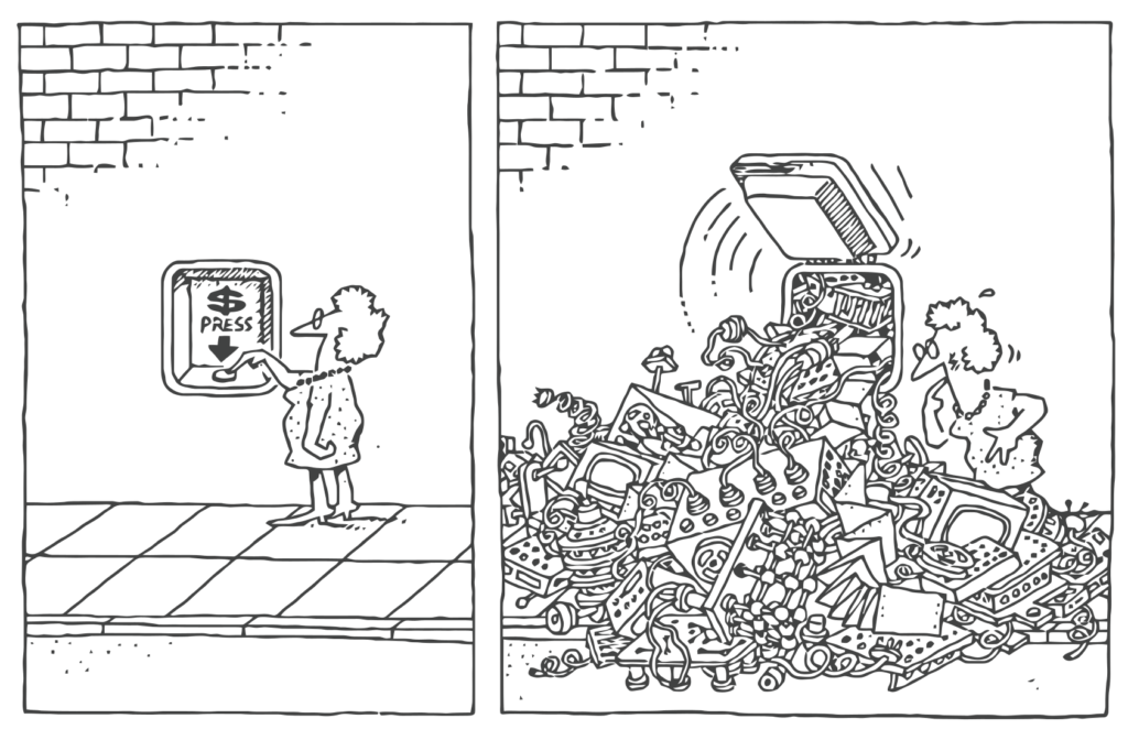
This captures so much truth. Our aim, when creating software, is to give people the interface on the left – a way to use the system that is easy to use, intuitive, and fits with their experience both before and after the interaction. It is not easy to make things easy-to-use. It takes a lot of work, trial-and-error, insight, blood, sweat, and tears.
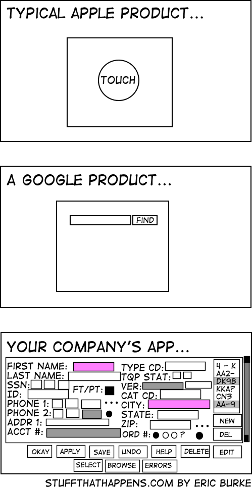
It is easier to create convoluted user interfaces. Often a monstrous UI results from a lack of understanding of the problem domain. It is almost always a symptom of thinking more about the software solution than the client’s problem. In fact, by thrusting a sub-optimal UI in front of the poor user, haven’t we just added to her problems instead of solving them?
How do we avoid the traps that lead to bad user interfaces? How do we engineer the illusion of simplicity? There are books on the subject – the short answer is “read those books” 🙂 But let me highlight one key idea.
Separate UX from UI
A common trap is to equate the interface the user operates with the user’s experience. It is not easy to distinguish at first – though once you do you will never look at UI design the same way. The first step is to realize there is a difference.

Think of UX, or User eXperience, as the story the user will tell they’ve done their work. This story is not told in terms of buttons or widgets – it is a description of the flow of work, told in terms of tasks and objectives. That story begins before the computers are turned on and continues after they close the app. It’s the user’s story, not the system’s story.
Let’s make a UI
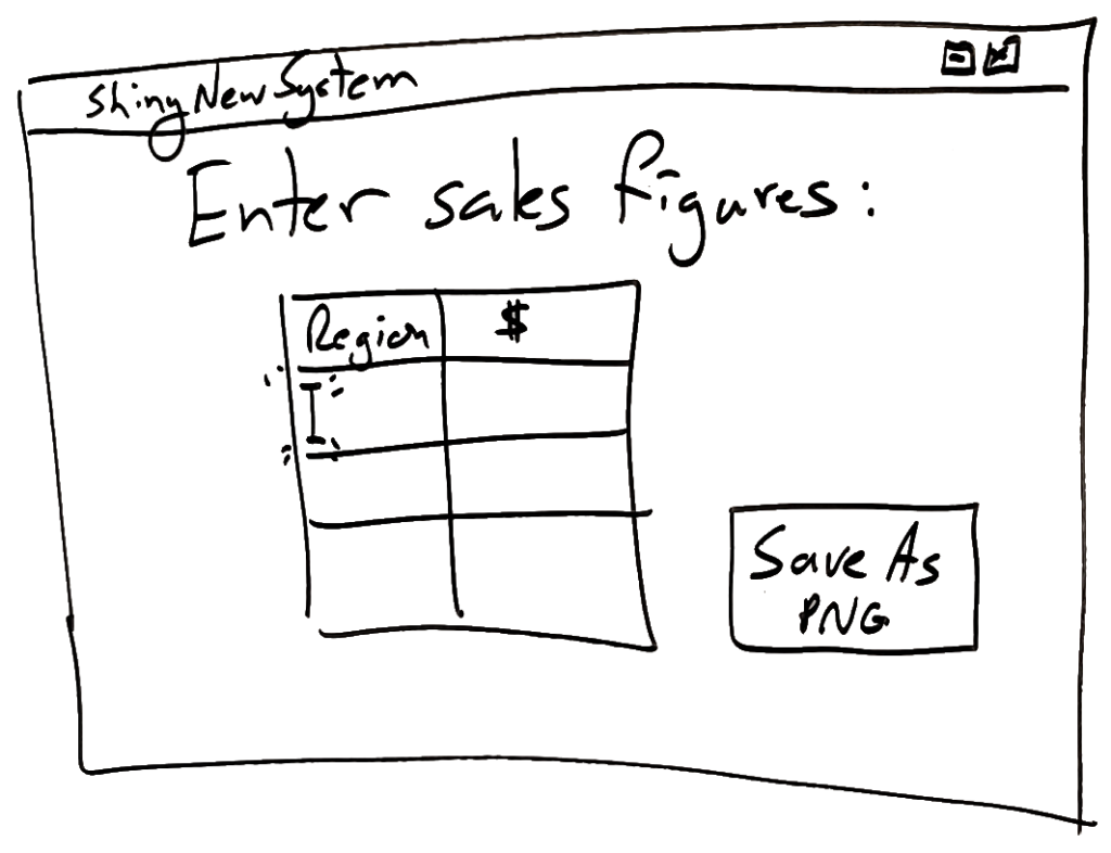
A UI, or User Interface, as we all know is the thing the user manipulates while using the system. Here is our task: Design a UI to convert sales figures from our three regional sales managers into a bar chart. Our client uses Excel to do this today and hates it – wants something easier to use. Maybe our UI will look like this:
That’s not bad! We build the system. The feedback from UAT is “This is way easier than Excel!” Mission accomplished. We deservedly pat ourselves on the back for a job well done.
But did we miss something?
Let’s design a UX
So we were asked to make something easier to use than Excel to create a chart. Before rushing to the UI design, let’s write down the user’s experience as experienced today. What does she do before she can begin working? What does she do with the chart after she makes it? How can knowing the before and after influence the UI design that will come later?
The UX Today (AS-IS)
- I power up my laptop, log in.
- It is the end of the month. My boss needs a one-pager with a chart showing sales performance.
- I open Outlook, find the messages from Pat, Darcy, Jesse – the three regional sales managers.
- I copy the sales figures from their emails and paste them into Excel
- I enter formulas, slice and dice the numbers, then use the chart wizard to create a bar chart.
- I go back to Outlook, write an email to my boss, copy/paste the chart, send it.
Now that we understand the AS-IS UX, how can we improve it? The UI we created earlier saves time on step 5 – which is good. But how about this:
The Redesigned UX (TO-BE)
- I power up my laptop, log in.
- It is the end of the month. My boss needs a one-pager with a chart showing sales performance.
- I open Outlook, find the messages from Pat, Darcy, Jesse – the three regional sales managers
- I forward each email to newsystem@pointw.com
- without any effort on my part, the system parses the sales data out of each email
- when the email from all regions are received, the system generates a draft email with the bar-chart already in it
- I receive an email from the system that I can tweak if necessary, then send it to my boss
Wow, that was unexpected – we need no UI at all! The experience of using Outlook is all we need to hook our solution into. In fact, maybe in v2.0 we get the sales managers to send their emails directly to the system and our user gets involved only in the tweak step.
Please note: this exercise merely gives a taste of the UX process and how it can powerfully inform UI design process. A good UX designer has skills, practices, tools, and techniques that take a lot of experience to master – none of which are reflected in my contrived example here.
Conclusion
First design (or redesign) a UX. Then design a UI (if one is even needed). It makes all the difference. Two separate creative tasks, two separate processes, two separate documents. UX design informs UI design and makes it better. It is one of the tools that allow us to engineer the illusion of simplicity.